Pivot Table
The pivot table view shows incursion data broken down by the dimensions you choose.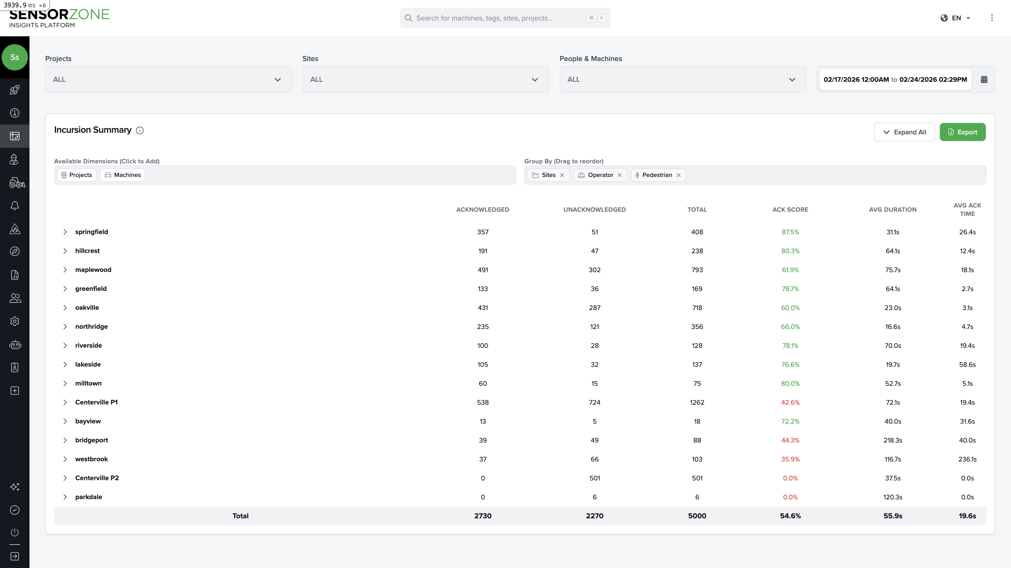
Understanding the columns
| Column | Meaning |
|---|---|
| Acknowledged | Number of incursions where the operator acknowledged the warning |
| Unacknowledged | Number of incursions with no acknowledgement |
| Total | Total incursion count |
| ACK Score | Acknowledgement rate as a percentage, color-coded: green (good), yellow (moderate), red (poor) |
| Avg Duration | Average length of incursions |
| Avg Ack Time | Average time for operators to acknowledge warnings |
Choosing dimensions
Use the dimension selector to control how data is grouped. Available dimensions include:- Sites — Group by worksite
- Projects — Group by project
- Operator — Group by the person operating the machine
- Pedestrian — Group by the person on foot
- Machine — Group by base station/equipment
- Date — Group by day, week, or month
Expanding rows
Click the arrow next to any row to expand it and see the next level of detail. For example, if grouped by Site → Operator, clicking a site name reveals the operators active at that site.Saved views
Save your favorite dimension configurations as Saved Views so you can quickly return to commonly used analyses without reconfiguring each time.- Set up your dimensions and filters
- Click Save View
- Give it a name (e.g., “Weekly Site Comparison” or “Operator Performance”)
- Access saved views from the dropdown at any time
Exporting data
Click Export to download the current pivot table as an Excel spreadsheet. The export includes all visible data with the current dimension groupings and filters applied.Map Heatmap
The heatmap view shows incursion data plotted geographically, with advanced filter controls for deeper analysis.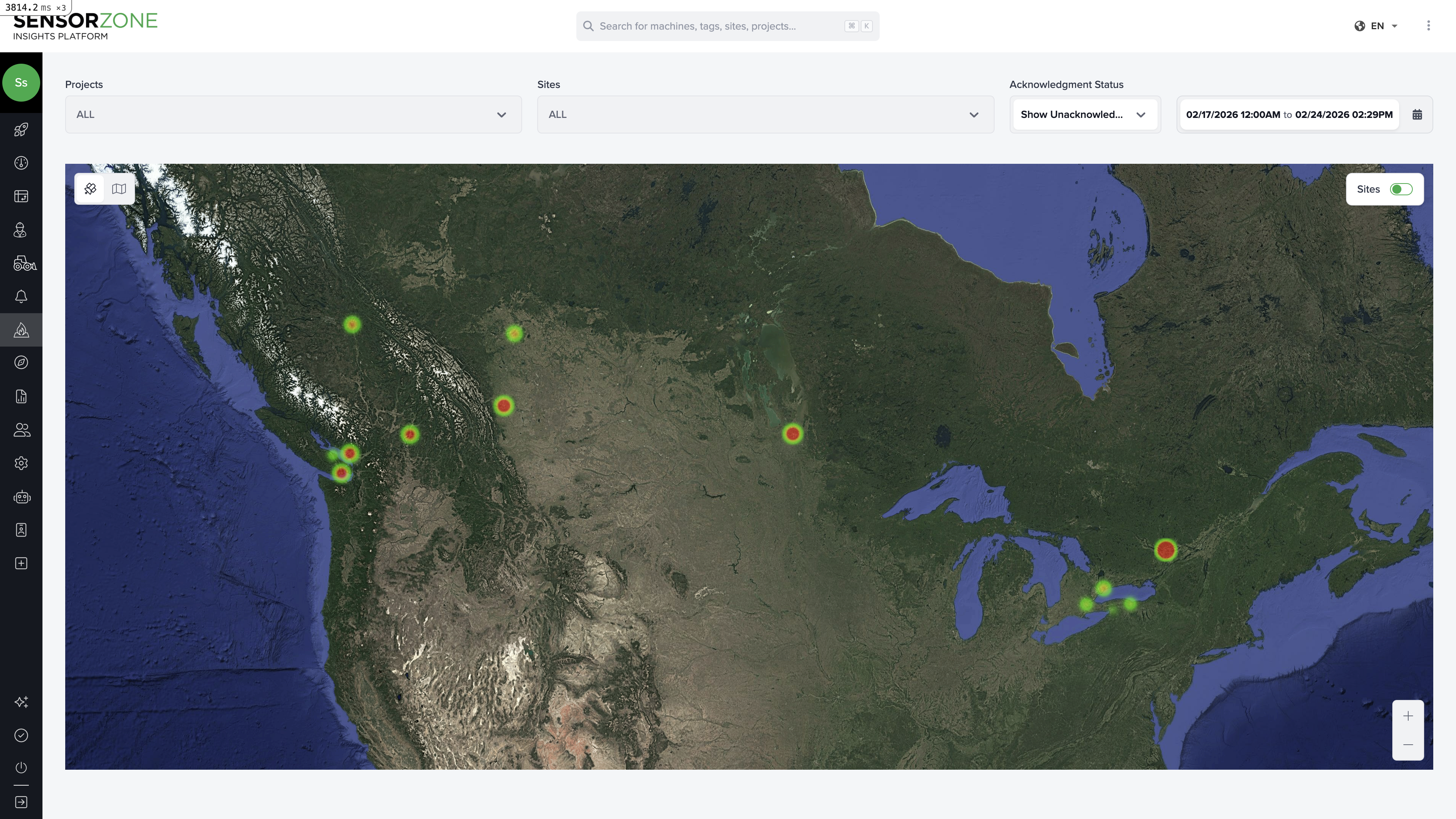
Filter controls
The heatmap includes powerful filters not available on the standard Heat Map page:- Acknowledgement status — Show all, acknowledged only, or unacknowledged only
- Duration range — Filter by incursion length (e.g., only show incursions longer than 30 seconds)
- Time to acknowledge — Filter by how quickly operators responded
- Time of day — Focus on specific hours (e.g., morning shift vs. afternoon)
Visualization modes
Switch between different marker colorings:- Severity — Color by acknowledged vs. unacknowledged
- Duration — Color by incursion length
- Time to acknowledge — Color by operator response time
Screenshot capture
Use the built-in screenshot capture to save images of the current map view for reports and presentations. Options include:- Single site screenshot
- Multi-site comparison
- Full map overview
Common analysis workflows
Which sites need the most attention?
Which sites need the most attention?
- Open the pivot table grouped by Sites
- Sort by ACK Score ascending to find sites with the lowest acknowledgement rates
- Check the Total column to prioritize sites with both low scores and high volumes
Which operators need additional training?
Which operators need additional training?
- Group by Operator
- Sort by ACK Score ascending
- Check Avg Ack Time — slow response times suggest the operator isn’t engaging with the warning system
- Cross-reference with the person’s detail page for more context
Are incursions getting better or worse over time?
Are incursions getting better or worse over time?
- Group by Date (weekly or monthly)
- Compare Total and ACK Score across periods
- Export and chart the trend in a spreadsheet for presentations
Where exactly do incursions happen within a site?
Where exactly do incursions happen within a site?
- Switch to the map heatmap view
- Filter to a single site
- Zoom in to see individual markers
- Use the duration filter to focus on longer (more dangerous) incursions
- Identify hotspots and consider physical changes (barriers, signage, route changes)
Next steps
Dashboard
Return to the Overview dashboard.
Reports
Generate formal safety reports from your analysis.