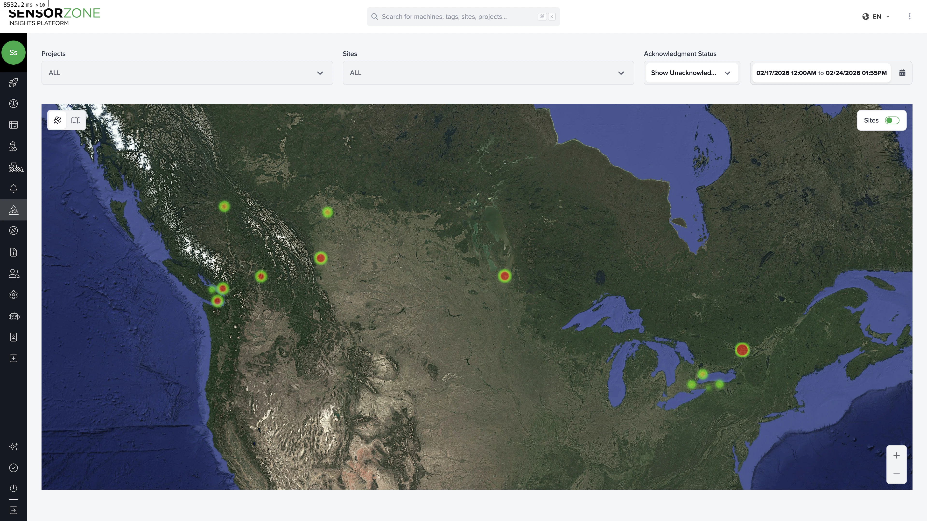
Reading the heatmap
The heatmap overlays incursion density on a map of your worksites. Areas with more incursions appear in warmer colors (red/orange), while lower-activity areas appear cooler (green/blue). This helps you:- Identify high-risk zones within a worksite
- Spot patterns in where incursions cluster (e.g., near site entrances, loading areas)
- Compare relative risk across different sites at a glance
Filters
Use the filters at the top to refine the heatmap:- Date range — Focus on a specific time period
- Projects — Show only sites within selected projects
- Sites — Show specific worksites
- Acknowledgment status — Filter by acknowledged, unacknowledged, or all incursions
Zooming and navigation
- Zoom in to see finer-grained density within a single worksite
- Zoom out to compare incursion density across all your sites
- Click any worksite boundary to see its name and summary data
Using heatmap data for safety improvements
Common actions based on heatmap findings:- Hotspot near an entrance — Consider adding barriers, signage, or rerouting pedestrian traffic
- Cluster around a specific machine — Investigate whether the machine needs relocation or additional safety measures
- Consistent pattern over time — Use for safety briefings and training to raise awareness of high-risk zones
Next steps
Reports
Generate formal safety reports that include heatmap data.
Advanced Insights
Dive deeper with the pivot table and map heatmap.