Deep dive into a person’s safety record — pedestrian incursions, operator performance, and tag testing compliance.
When you click a person’s name or the MORE button on the People page, you open their detail page. This page has three tabs that give you a complete picture of their safety interactions on site.
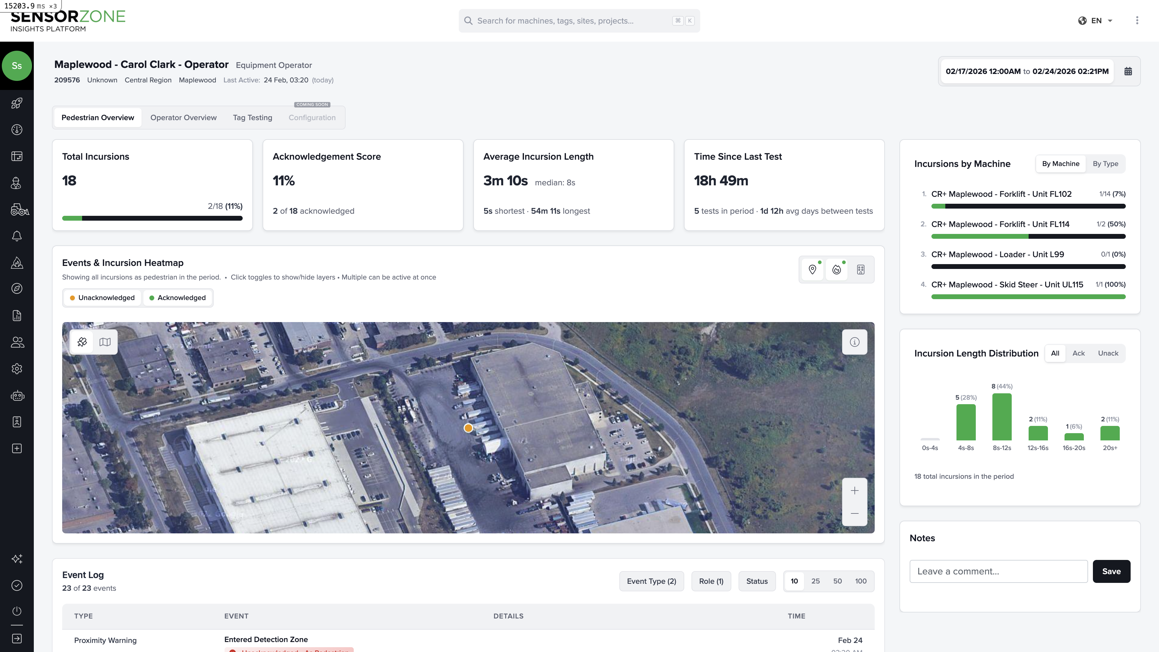
The satellite map shows the geographic location of each incursion event, color-coded by acknowledgement status:
Green markers — Acknowledged incursions
Orange/Red markers — Unacknowledged incursions
Zoom in to see exactly where on the worksite events occurred. Clusters often indicate high-traffic crossing points or areas where pedestrians regularly interact with machinery.
The sidebar shows which machines this person interacted with most. This helps you identify whether a specific machine or area is driving most of the risk for this individual.
A histogram showing the spread of incursion durations. Short incursions (a few seconds) are typically walk-by events, while longer ones may indicate someone working in close proximity to a machine.
The sidebar lists which pedestrians this operator encountered most. If one person keeps appearing, it may indicate a workflow issue (e.g., a spotter who stands too close, or a route that crosses the machine’s path).
A chart showing when and how long this operator ran their machine each day. Useful for understanding shift patterns and correlating with incursion activity.
Shows how quickly the operator responds to warnings. Fast acknowledgement times indicate good awareness. Slow or missing acknowledgements may warrant additional training.
All three tabs share a Notes section in the sidebar. Use it to document safety conversations, training records, or observations about this person’s behavior on site. Notes include an author name, content, and timestamp.