Key metrics
At the top of the dashboard, you’ll find summary cards showing:| Metric | What it means |
|---|---|
| Total Incursions | All proximity events between tags and machines in the selected period |
| Acknowledged | Incursions where the operator pressed the acknowledgment button |
| Unacknowledged | Incursions with no operator acknowledgment — higher risk events |
| Acknowledgment Rate | Percentage of incursions that were acknowledged |
| Active Tags | Number of tags that recorded at least one event |
| Active Machines | Number of base stations that recorded at least one event |
| Incursions per Runtime Hour | Normalized safety rate — total incursions divided by total machine runtime hours |
Filtering data
Use the filter bar at the top of the page to narrow the data:- Date range — Select a predefined period (today, this week, this month) or set a custom range
- Projects — Filter by one or more projects
- Sites — Filter by specific worksites within the selected projects
- Acknowledgment status — Show all, acknowledged only, or unacknowledged only
Charts
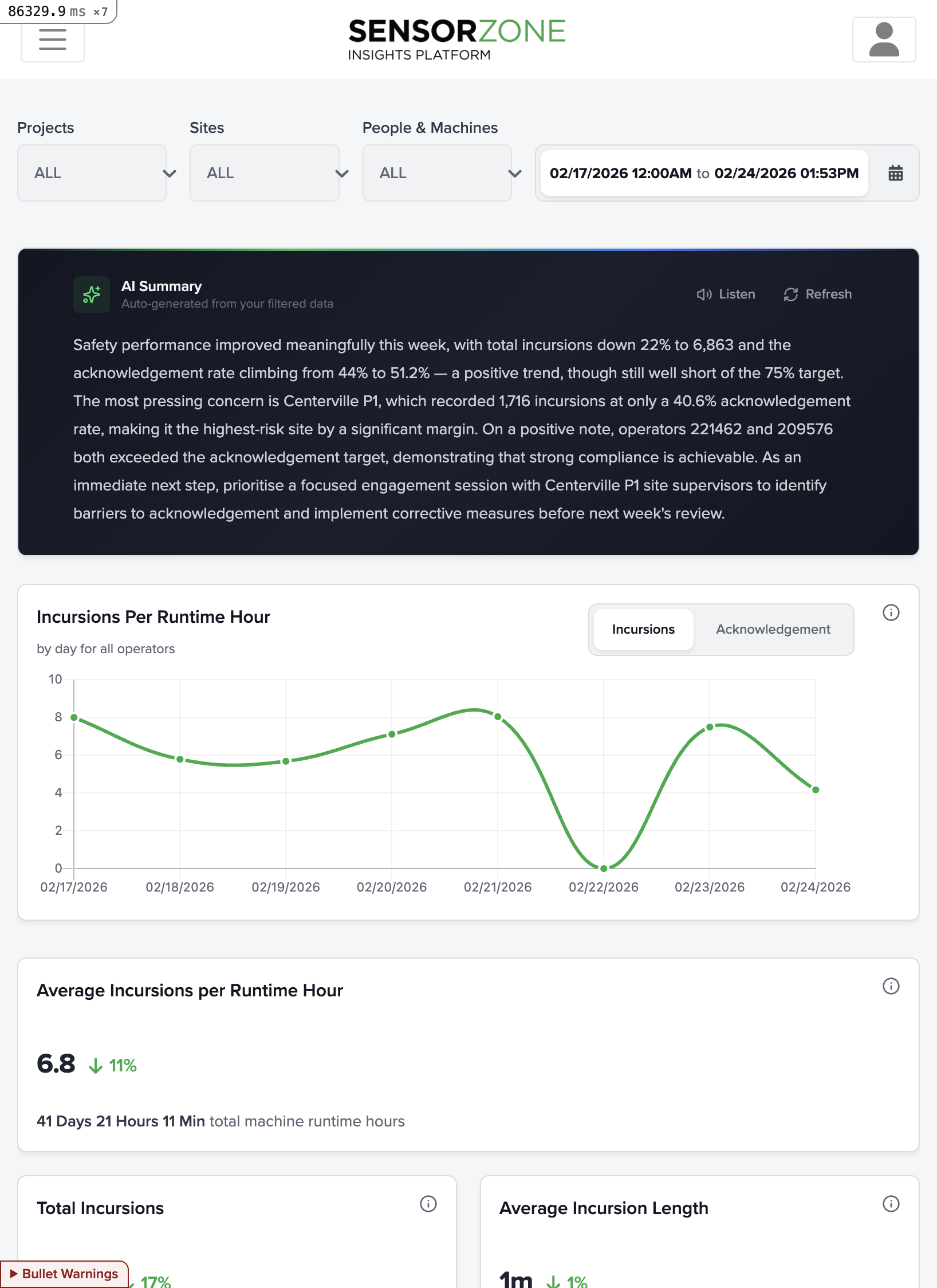
The dashboard includes several chart types:Incursion trend chart
A time-series chart showing daily incursion counts over the selected period. Acknowledged and unacknowledged incursions are shown as separate series so you can compare patterns.Project comparison
A bar chart ranking projects by their incursion counts, helping you identify which projects need the most attention.Site comparison
Similar to the project chart but broken down by individual worksites, useful for pinpointing specific high-risk locations.Top machines and tags
Lists of the machines and tags with the highest incursion counts, so you can quickly identify repeat offenders or high-exposure equipment.Advanced Insights
For deeper analysis, click Incursion Summary in the navigation (or Advanced Insights from the dashboard) to access the pivot table and map heatmap. These let you slice incursion data by any dimension — sites, projects, machines, people, time — and export the results.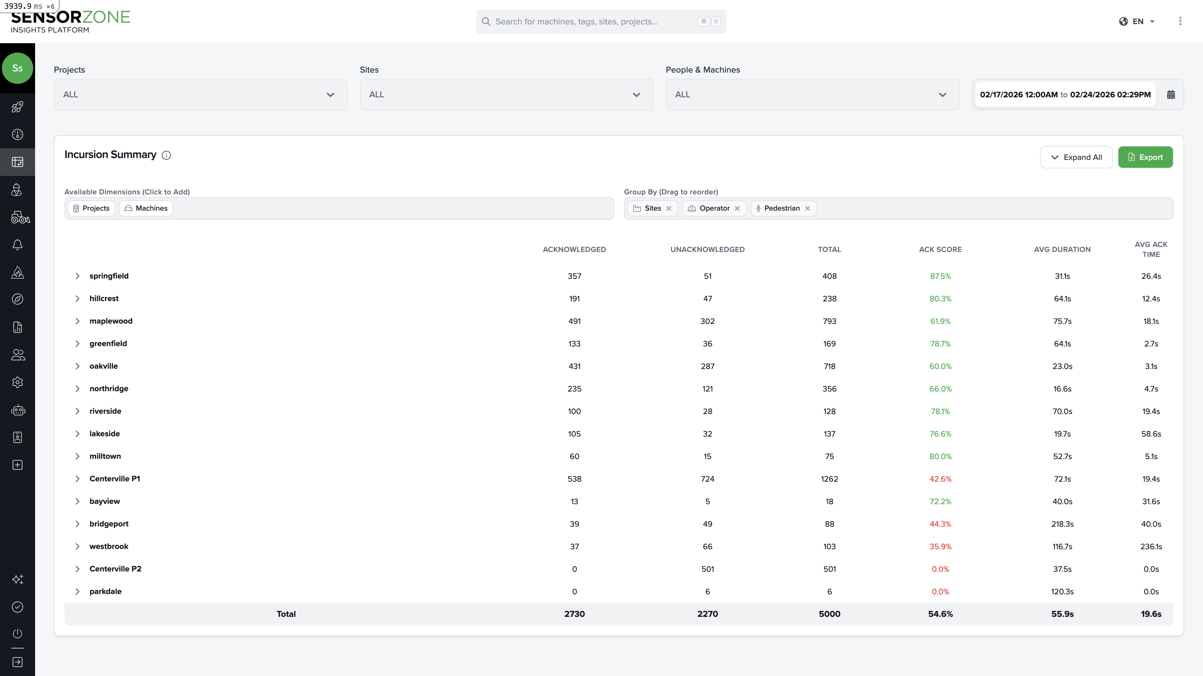
Full Advanced Insights Guide
See the complete guide to the pivot table, map heatmap, saved views, outlier analysis, and common analysis workflows.
Next steps
People
Manage tags and personnel.
Machines
Monitor your fleet and base stations.